In our fourth Urvanity Meets session we connect with the Portuguese artist and illustrator Diogo Machado, better known as Add Fuel (Cascais, 1980), to get into his studio located in Cascais.
After graduating in graphic design and working for several years in design studios between Germany and Portugal, in 2007 Add Fuel decided to dedicate himself fully to his artistic work. He began by reinterpreting and bringing to his terrain the language of the traditional Portuguese blue and white tile, combining classic decorative elements with references from his contemporary visual imagery. He took his work with patterns and symmetrical elements, that he began elaborating on tiles, to another level, painting these patterns with stencil and spray cans on walls, also creating screen-print and toys limited editions and even on clothing.
We sneak into his studio, packed to the top with boxes containing his new artwork ready to be shipped to Los Angeles for his next exhibition in Subliminal Projects, rescheduled for October and we catch up talking about future projects, his creative process and work method through his iPad and his evolution towards volumetric pieces. Check out the complete video by clicking here or click on #UrvanityMeets to catch the previous ones on our IGTV Channel.
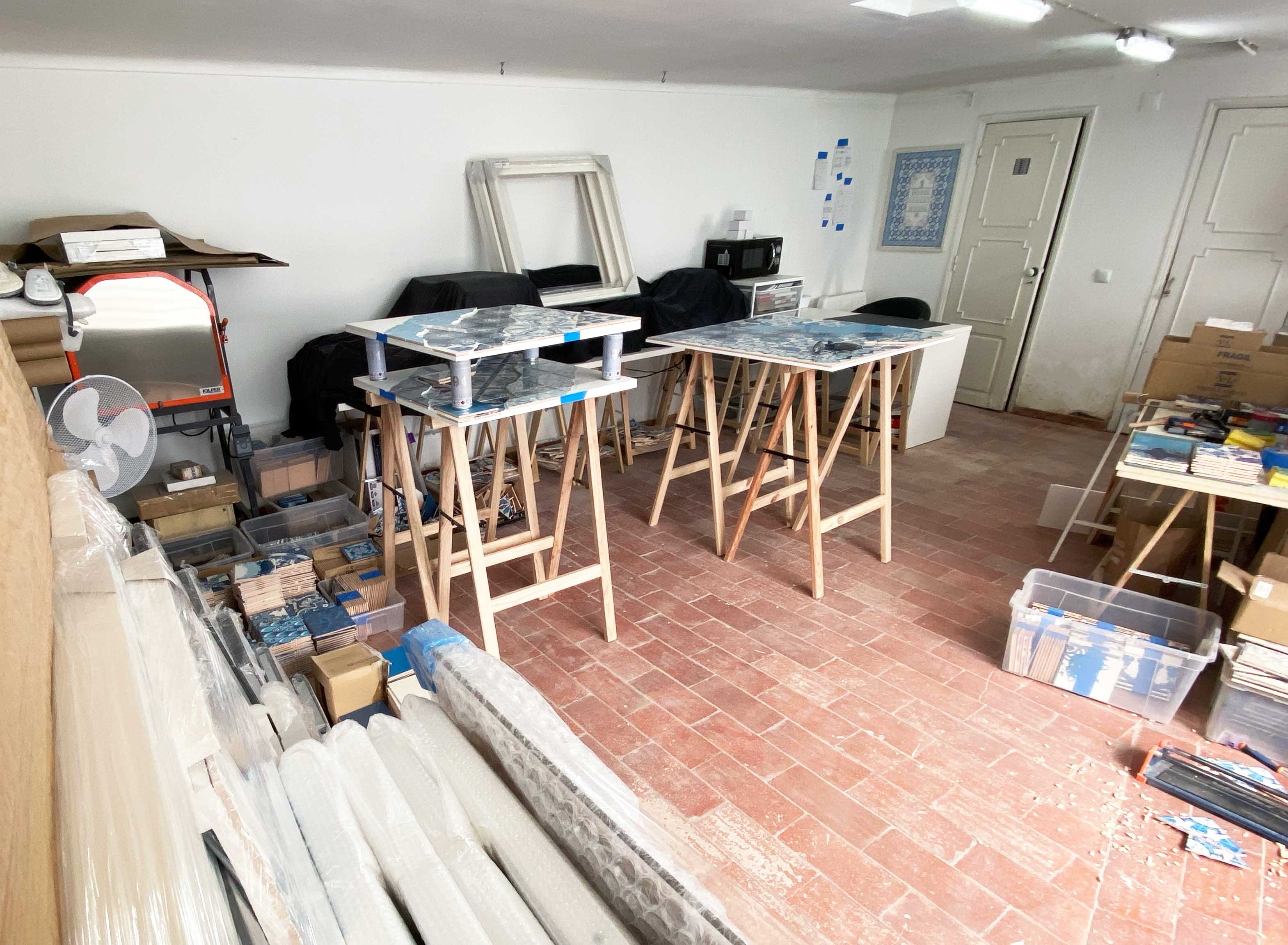
Studio general view
«My studio it’s a small and super packed space but it’s where we get it all done. Now I have a lot of stuff here waiting to be shipped because I had a show scheduled for April 25th in LA that of course, due to this situation, has been postponed. It was going to be my US debut solo show at Subliminal Projects. Probably it will be announced in a few months , hopefully for October, and if that doesn’t happen it will have to be rescheduled for next year. Still I’m very confident that it’s going to happen. It’s going to be quite a big show, last time I checked there were like 40 – 50 new works, it’s been three and a half months in the making».
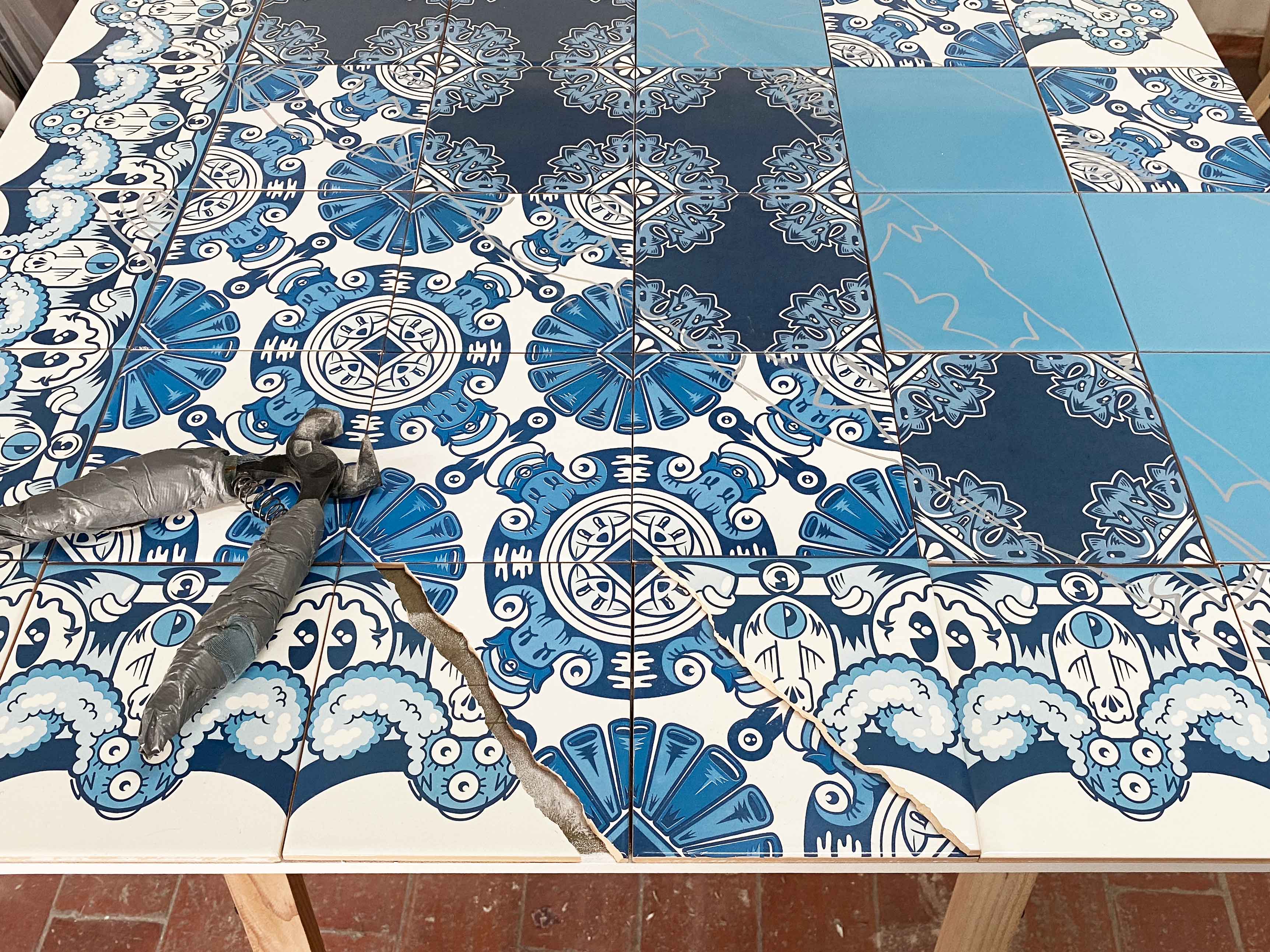
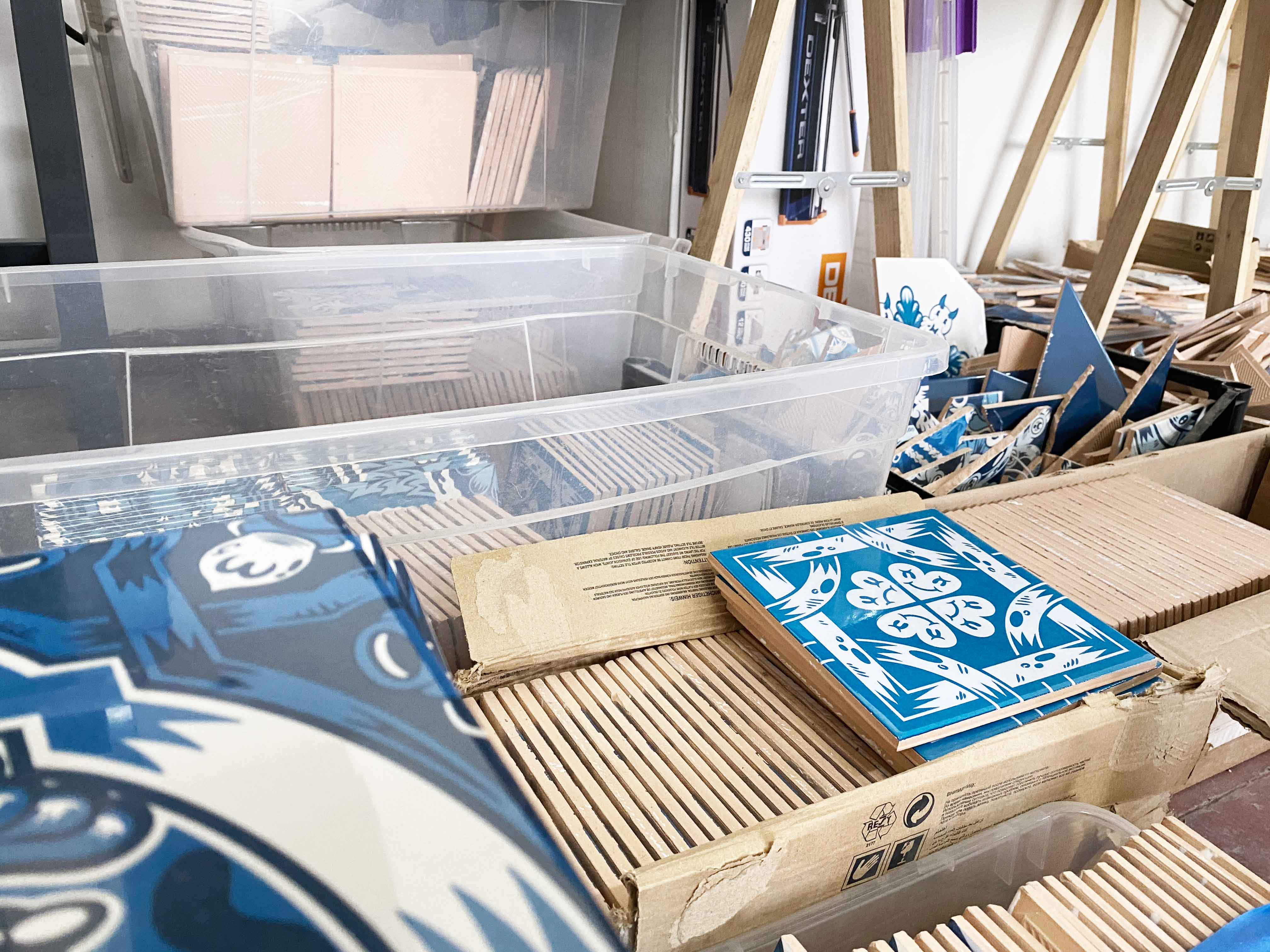
Ongoing piece at Add Fuel’s studio
Some tiles leftovers with which he creates 3D effects
«I have some ongoing pieces around here too. This one to the left is a 1×1 meter piece I’m working on right now and it’s on a very early stage still. The tiles are not even stick together to the wood base. If you look closer you can tell the drawn lines of the motion of the piece and where I will cut the tile after. When I work on walls, I don’t normally use tiles, I paint with stencils [and spray paint], so the effect it’s different but it remains the same visual language that I look for when creating this layer effect. Actually, both lines of work connect really well in between each other. In my beginnings I didn’t started by painting walls, I actually started by placing small tiles on walls, like Space Invader style, and then I shifted into painting. It was kind of a reverse process. I never intended to be any sort of tile master but it kind of happened. I started playing around, checking the different possibilities of this very strong ceramic heritage that we have in Portugal and it felt so natural and interesting to experiment with all these different techniques. It really comes out from my passion for patterns, symmetries, balanced compositions… If you look at my tiles there are two possible readings: you can see these little characters with eyes, animal creatures… but once you zoom out it can be perceived as a more traditional pattern».
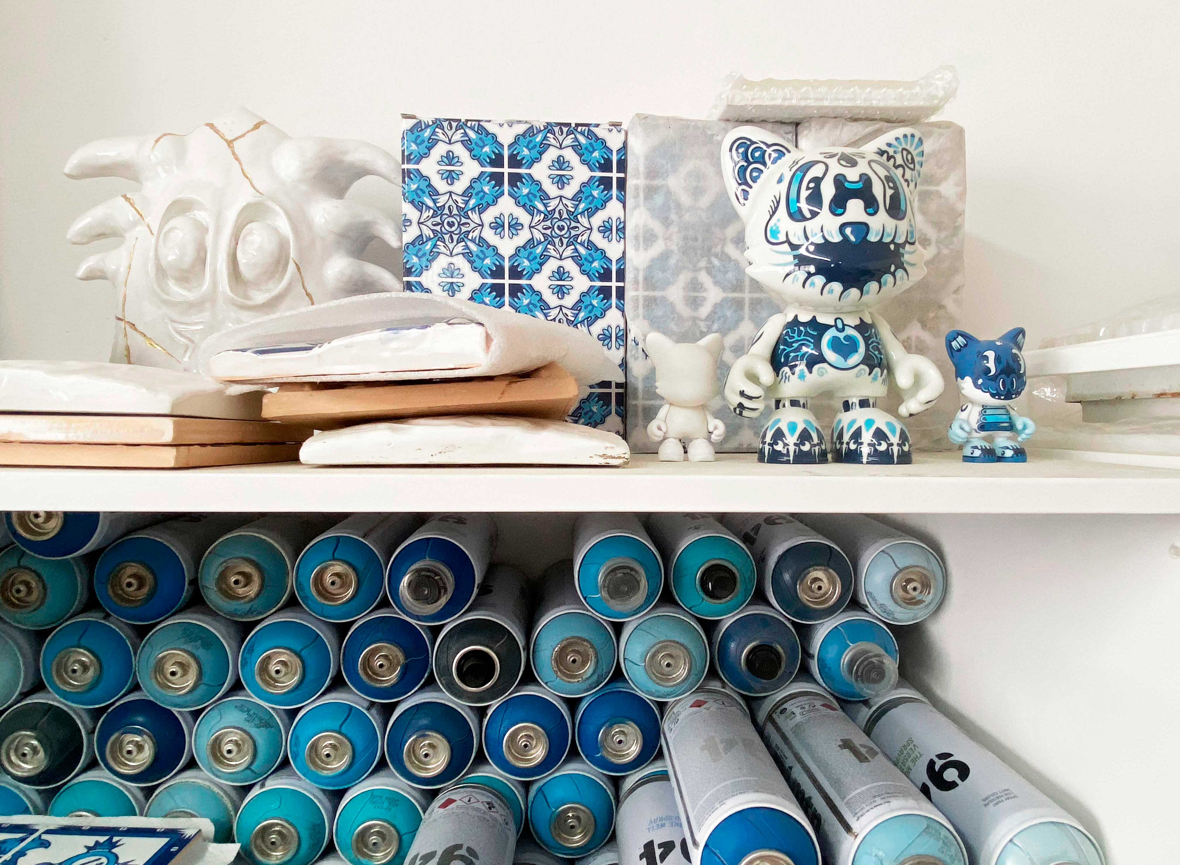
Ceramic sculpture (left) and Superplastic toys (right)
«I’m also very interested in 3D characters, I’m just like a big child! These three figures to the right are the vinyl toys I made with Superplastic!, a US brand I did a collaboration with. There’s the small piece and the standalone version of it. The vinyl has this gloss effect that makes it look like ceramic. I’m very interested in transferring my work from 2D to 3D. Working with layers itself helps with giving this effect but it’s still not volumetric. When people come to my shows of course they expect a blue and white tile exhibition, so last year I did a show in the Parisian gallery Itinerrance where I tried to introduce new stuff like the white sculptures (left on the picture) and some pieces with a new technique I was working on with steel. They were like stencils made out of steel. It was very interesting to work with a different material that is not ceramic and that’s what will also happen on my next LA show, there’s going to be sort of an evolution of these metal pieces».
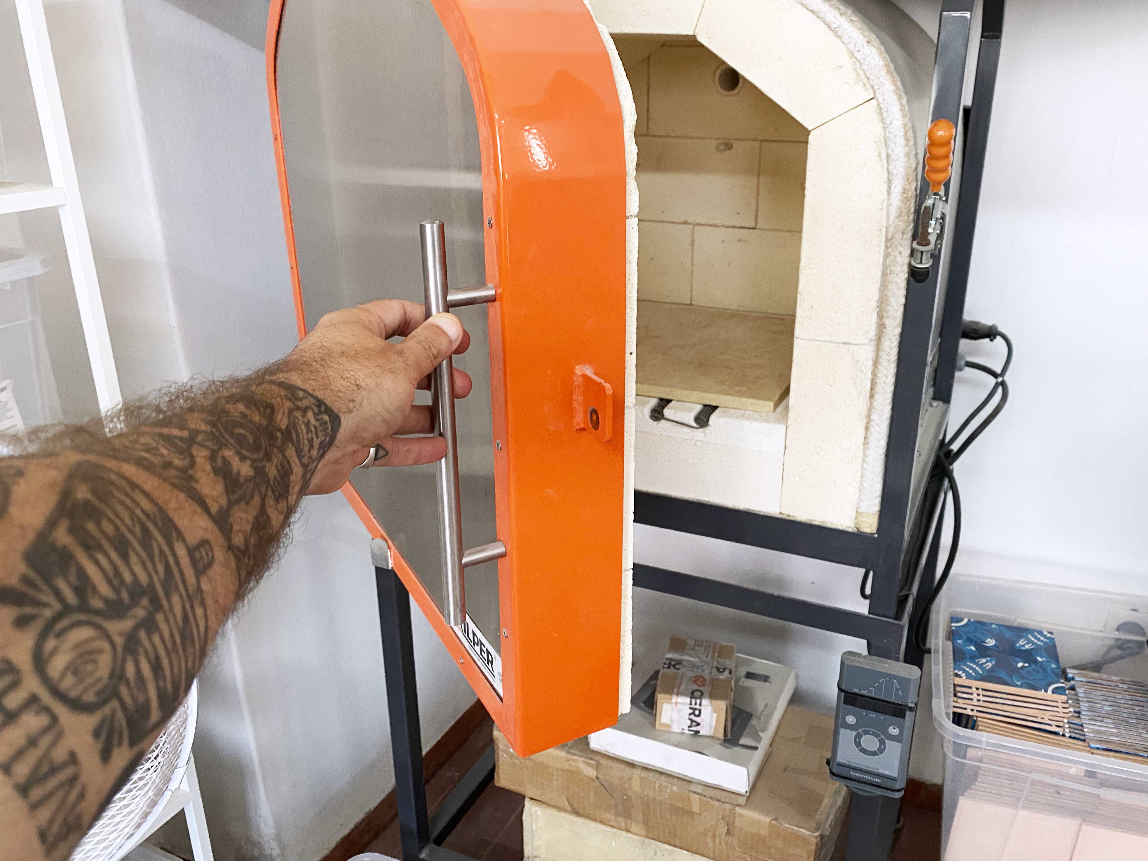
His ceramic kiln
«Everything I know about ceramics -which is not that much because it’s a very bast world- was self-taught through try and error. I bought the kiln oven and I had no idea of how to work with it so I just experimented, checked online… It’s not a big kiln but fair enough for now. It’s a bit difficult to find information about tile painting and ceramics the way I wanted to do it. What I used to do here in my studio, which I don’t do that often anymore, was to hand paint in white and cobalt blue. Lately I’m using a digital technique through transfer to the ceramic that after goes into the kiln heating system. There’s also another technique that involves screen-printing… All of these techniques I try them by myself at the studio».
New 3D tiles that he will soon launch
«I’m now collaborating with Viuva Lamego, one of the oldest tiles factories in Portugal. These are hand painted three dimensional tiles and they approach these sculptural effect that I was looking for. When you put a few of them together you can create nice patterns. These ones are going to be release as a time-gated edition, which means they are not going to be limited on number but limited on time, you will be able to buy them for a certain limited period of time. They will be released very soon! For me personally this means a step towards something that goes into this future facing three dimensional work. I’m not sure if the white one will be for sale too or if I will paint it but I really like it».
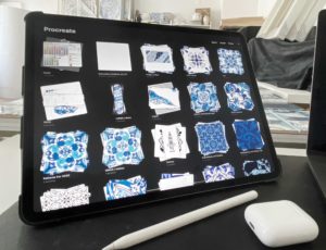
Some designs on his iPad
«All the patterns I draw are designed by hand and there are two different processes I use to create them. The first one is browsing through all the tiles books I have, or even on the Internet. After going through them I close everything and draw immediately by memory creating a pattern. The second one is basically to start from scratch. Until mid-last year I used to draw everything by hand before switching to an iPad, which made the whole process so much easier. The files are already digital and I can easily sketch something with a mirror effect that lets me see how the pattern will end up. Lately I’m applying some letters to my work that come from my bad graffiti days back on time (laughs). I kept the taste for letters and actually I’m starting to include it more and more. It’s a nice connection transmitting a message, it makes it easier for an idea to follow through. It also complements the pattern, the compositions become more balanced if they have typography, otherwise it’s an overload of patterns everywhere. I’m always trying to find new elements that I can use along with the patterns without taking the main focus from them».

